Key Takeaways
- In order to learn how to read crypto charts, it's important to dedicate time to understanding and identifying chart patterns, as well as their implications;
- Reading crypto charts is a big part of learning how to know when crypto will rise or fall;
- While learning how to read crypto charts doesn't guarantee success in all your trading, crypto value analysis can greatly improve your chances of making timely decisions and achieving great results.
Free Airdrop Season 7 is LIVE! Answer fun questions or do simple tasks to earn rewards from the $30K BitDegree prize pool. Participate Now ! 🔥
Whether you're a seasoned trader or just getting started, understanding how to read crypto charts is like having a treasure map in this digital gold rush.
Crypto charts may seem intimidating at first, filled with lines, candles, and jargon like "MACD" and "RSI". But fear not, I'll break down the basics of crypto chart analysis in simple terms, so you won't have to trade blindly anymore.
Before we dive into the matter of how to read crypto charts, however, here's a piece of advice: always trade on reputable exchanges, like Binance, Bybit, and Kraken.

Did you know?
Subscribe - We publish new crypto explainer videos every week!
What is Ethereum & What is it Used For? (Animated Explanation)


Table of Contents
How to Read Crypto Charts: The Basics
To understand how to read crypto charts, it's important to understand what they are.
Latest Deal Active Right Now:Head to BitDegree Missions, gather as many Bits as possible & claim your stake of the $30,000 Prize Pool! Don't waste your time & start collecting Bits by completing Missions and referring friends.
Crypto charts, in their essence, are visual representations of a cryptocurrency's price movement over a specific period. They look like graphs, showing price changes over time.
Thus, crypto charts are like maps for navigating the turbulent waters of the cryptocurrency market. They provide valuable insights into the price, volume, and historical performance of cryptocurrencies[1].
If you're interested in trading or investing in digital currencies, understanding how to read crypto charts is crucial.
Most Popular Types of Crypto Charts
Understanding the different types of crypto charts is a crucial step on your journey to becoming a savvy cryptocurrency trader who knows how to read crypto charts. So, let's break down some of the most common types of crypto charts that you're likely to encounter.
Line Charts
Let's start with the basics - line charts.
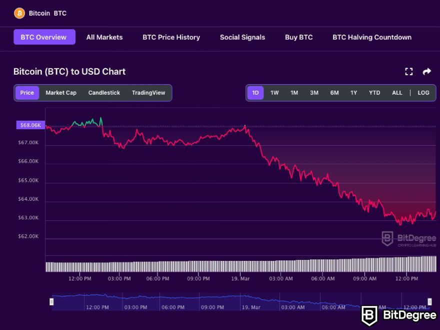
Line charts provide a simple and clean way to visualize the price of a cryptocurrency over time. This type of chart connects the closing prices of an asset with a continuous line.
By connecting the dots, you can spot trends and get a sense of the overall price direction.
Line charts are great for getting a quick, bird's-eye view of an asset's performance and are always present in any crypto value analysis.
Candlestick Charts
Candlestick charts are the most popular among traders. They give you more detailed information than line charts.
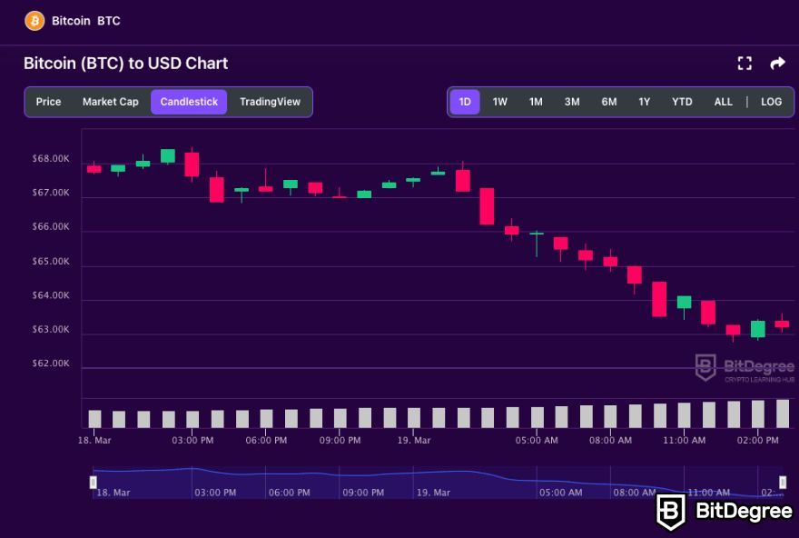
Each candlestick represents a specific time frame and displays the open, close, high, and low prices. The body of the candlestick is shaded, and the wicks show the high and low prices.
How to know when crypto will rise or fall? Well, candlestick patterns can help you predict price movements, making them a valuable tool for crypto technical analysis.
Additionally, note that there are candle volume charts, which combine the information from candlestick charts with trading volume. The width of each candle is determined by the trading volume during that time period. These charts can help you gauge the strength of price movements and identify potential reversals.
Bar (OHLC) Charts
Bar charts are similar to candlestick charts but with a different visual representation. They are also known as OHLC charts, which stands for Open, High, Low, and Close charts.
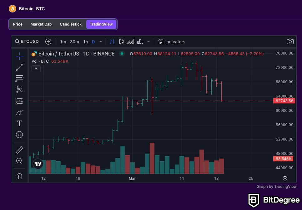
In these charts, the open and close are represented by horizontal lines pointing left and right, while candlesticks use a real body to show the open and close.
The top of the stick represents the high, the bottom represents the low, the horizontal line to the left indicates the open, and the one to the right is the close price. When the market is bullish, the stick will typically be green, and it'll be red when representing a bearish period.
OHLC charts are commonly used in crypto tech analysis, and in financial markets as a whole.
Renko Charts
Renko charts focus solely on price movement, filtering out time. They use bricks or blocks to represent a fixed price increment. When the price moves above or below a certain value, a new brick is added.
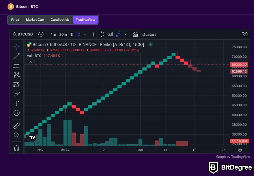
These crypto value analysis charts can help you identify trends and reversals with greater clarity, especially if you prefer a more streamlined view.
Of course, there are more chart types, but these are among the most used ones. Each type of chart has its unique advantages and drawbacks, and the choice of chart type often depends on your trading strategy and personal preference. With practice and experience, you'll discover which charts work best for your trading style.
Timeframes and Intervals
Now, there are two concepts you must understand when it comes to crypto charts – timeframes and intervals.
Timeframes refer to the specific period over which price data is represented. Grasping this concept is imperative when learning how to read crypto charts.
Depending on the charting tool you're using, you can choose from a range of timeframes, such as minutes, hours, days, weeks, or even months. Each timeframe provides a different perspective on the cryptocurrency's price action.
For instance, if you're a day trader looking for short-term gains, you might opt for shorter timeframes like one-minute, five-minute, or hourly charts. These charts display rapid price changes, ideal for quick decisions.
On the other hand, if you're a long-term investor, weekly or monthly charts can help you spot broader trends and make more patient choices.
Now, let's talk about intervals – another essential concept for anyone who wants to know how to read crypto charts. I'm referring to the intervals between each data point on the chart. The interval depends on the chosen timeframe.
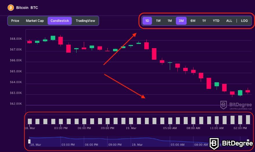
For instance, a one-hour chart may have data points every minute, while a five-minute chart could have them every minute. The choice of interval affects the level of detail you can observe, as shorter intervals provide a more granular view of price fluctuations.
Here's an example to put it all together:
Imagine you're looking at a one-hour chart with five-minute intervals. This means that each data point on the chart represents the cryptocurrency's price every five minutes over the past hour. It's like watching a time-lapse video of price movements.
If you're a day trader, you'll likely focus on shorter timeframes and intervals to catch quick price movements, while long-term investors prefer longer timeframes and intervals to spot overall trends.
Remember, there's no one-size-fits-all approach. Your choice of timeframe and interval should align with your goals, risk tolerance, and the specific cryptocurrency you're trading.
It's a bit like picking the right lens for the perfect shot. So, don't rush this decision. Experiment, see what works best for you, and adapt as needed.
Anatomy of a Candlestick
On the path to learning how to read crypto charts, you've already learned about quite a few types of charts. However, as mentioned before, candlestick charts are the most popular type among investors – they're like the GPS of cryptocurrency trading.
Let's take some time to dive into the nitty-gritty of their anatomy.
Candlestick charts represent price movements over a specific time period[2]. Each candlestick tells a story about the price action during that time frame. Typically, you'll see two colors: green or red. Green candles mean the price went up during that period, while red candles indicate a price drop.
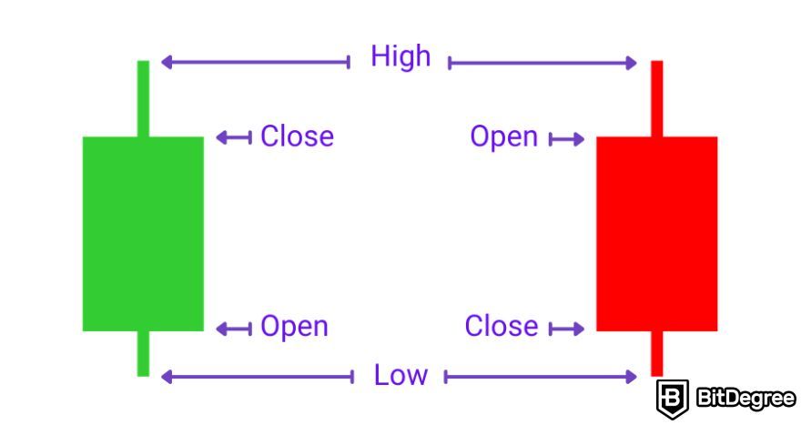
A candlestick has four main parts:
- Wick (or Shadow). This is the thin vertical line above and below the body of the candle. The upper wick represents the highest price reached during the period, while the lower wick shows the lowest price.
- Body. The rectangular area between the wicks is called the body. The body is filled (or colored red) if the closing price is lower than the opening price. If the closing price is higher than the opening price, the body is empty (or green).
- Open. The opening price captures the trading value of the first trade made during the period specified by a given candle. If the market is bullish (hollow / green candle), the open is on the bottom of the body. If the market is bearish (filled / red candle), the open is on the top of the body.
- Close. The closing price is the trading value of the last trade of that period. Therefore, if the market is bullish (hollow / green candle), the close is on the top of the body. If the market is bearish (filled / red candle), the close is on the bottom of the body.
Now, you might wonder: why all this fuss about candlesticks?
Well, candlestick patterns can give you insights into market sentiment. If you want to learn how to know when crypto will rise or fall, learning to read candlesticks is a must.
For example, a doji candlestick with a small body and long wicks can signal uncertainty or indecision in the market. On the other hand, a hammer or shooting star candlestick can suggest a potential trend reversal.
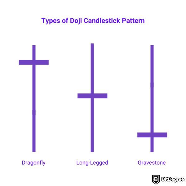
Candlestick charts help traders spot potential buy and sell signals, support and resistance levels, and much more. They're a bit like a secret code that, once deciphered, can help you make more educated decisions in the crypto market.
What is Dow Theory?
In your journey to deciphering how to read crypto charts, you also need to understand what Dow Theory is. As it turns out, Charles Dow's theories, developed over a century ago for the traditional stock market, provide valuable insights into understanding price movements in the crypto world.
Charles Dow, often considered the father of modern technical analysis, was a co-founder of The Wall Street Journal. His theories have withstood the test of time and are still widely used in the financial world today. The core principles of Dow Theory can be applied to crypto just as effectively.
That said, let's explore the concepts left by Dow that'll help you better grasp crypto tech analysis.
Six Tenets of Dow Theory
The Dow Theory offers six essential tenets that are equally applicable to cryptocurrency charts as they are to traditional stock markets. So, let's focus on how these principles apply to crypto technical analysis.
1. The Market Has Three Movements
Dow Theory divides market price movements into three categories: the primary trend, the secondary reaction, and daily fluctuations.
The primary trend is the major, long-term direction of a cryptocurrency's price, and it's what traders should focus on to make successful investments. Secondary reactions are temporary reversals within the primary trend, while daily fluctuations are normal price variations within those reversals.
2. Trends Have Three Phases
Dow Theory also breaks down trends into three phases. This applies to both bull and bear markets.
In a bull market, it starts with accumulation, as prices rise with increased trading volume. Then comes public participation, where retail investors join the trend. Finally, there's an excess phase with experienced investors exiting while others keep buying.
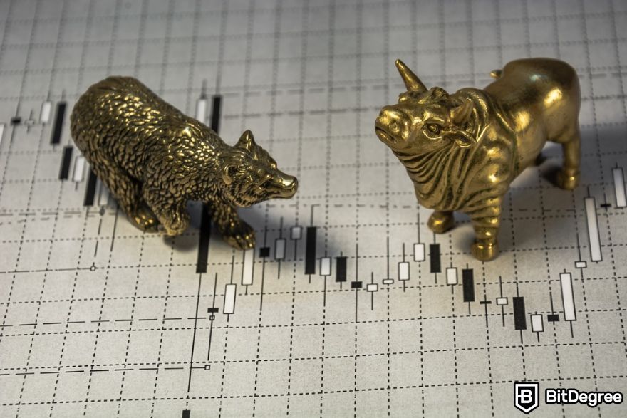
In a bear market, it begins with distribution, where news of decline spreads. The public participation phase sees retail investors selling to cut losses, often the longest phase. The panic phase follows when investors lose hope.
Understanding these phases is crucial for identifying the right entry and exit points in your trading.
3. The Market Discounts All News
This tenet suggests that all available information about a cryptocurrency, including historical price movements and future expectations, is already reflected in its price.
In other words, if there's news or information that could affect the crypto's value, it's most likely already factored into the chart. This is a key concept to grasp because it means you need to analyze past price data to make informed predictions about the future – which, for most investors, is the main point of learning how to read crypto charts.
4. Market Averages Must Confirm Each Other
This tenet emphasizes that when reading crypto charts, you should consider multiple indicators and averages to make a well-rounded assessment.

If various market indicators, like moving averages or trading volume, align with your analysis, it's a strong signal that your predictions are on the right track.
5. Trends Are Confirmed by Volume
Dow Theory highlights the significance of trading volume. Changes in trading volume can provide essential clues about the strength and sustainability of a trend.
Increased volume often indicates a more significant trend, while decreasing volume can suggest a weakening trend.
6. Trends Persist Until Definite Reversal
According to this tenet, trends tend to continue in the same direction until a clear reversal is confirmed. It's a reminder not to jump to conclusions based on short-term fluctuations. Instead, wait for solid signs of a trend reversal before making significant trading decisions.
Understanding these six tenets of Dow Theory is a fundamental step in learning how to read crypto charts effectively. By applying these principles, you'll gain insights into market behavior and increase your ability to make informed decisions, which can reduce the risk associated with cryptocurrency trading.
Technical Analysis
Now that you know more regarding how to read crypto charts, it's time to dive into crypto technical analysis. Technical analysis, simply put, is the art of studying past price movements to predict future ones[3]. It's like looking at the rearview mirror to navigate the road ahead. While it can't guarantee success, it provides valuable insights to help you make informed choices.
One of the fundamental tools in crypto tech analysis is trend analysis. This involves identifying patterns in the price movements of a cryptocurrency.
The two most common trends are an uptrend (when prices are going up) and a downtrend (when they're going down). Spotting these trends can help you decide whether it's a good time to buy, sell, or hold onto your digital assets.
Support and resistance levels are also crucial concepts. Imagine them as price boundaries. Support is like a safety net for prices, preventing them from falling too low. Resistance, on the other hand, acts as a barrier, preventing prices from rising too high. Understanding these levels can guide your decisions.
Moving averages are another technical analysis tool worth knowing. They smooth out price data over a specific time period, making it easier to spot trends.
A common strategy is to compare the short-term moving average to the long-term one. When the short-term crosses above the long-term, it's a potential signal to buy, and when it crosses below, it could be a signal to sell.
Now, let's talk about indicators. These are mathematical calculations based on price, volume, or open interest, and they provide valuable insights.
Popular indicators include the Relative Strength Index (RSI), the Moving Average Convergence Divergence (MACD), and the Bollinger Bands. Each of these can help you gauge the momentum, strength, and volatility of a cryptocurrency.
.jpeg)
Candlestick patterns are also a part of technical analysis. These colorful sticks on the chart tell a story. Various patterns, like doji, hammer, and shooting star, can provide clues about potential price reversals.
Lastly, don't forget about volume analysis. It shows how much of a cryptocurrency is being traded. High volume during a price move suggests strong interest, while low volume can signal a lack of enthusiasm. Combining volume analysis with other technical tools can give you a more comprehensive view.
While crypto technical analysis may seem complex at first, with practice and patience, you can become proficient in spotting trends, understanding support and resistance, and using indicators to your advantage.
Just remember, there's no foolproof strategy in the crypto world, but mastering technical analysis can certainly improve your odds of success.
Chart Patterns
Now that we've covered the basics of how to read crypto charts, it's time to shortly dive into a crucial aspect of chart analysis: chart patterns.
Ascending / Descending Triangle
The ascending triangle is formed by a horizontal resistance line and a rising trend line, indicating that the price is likely to break out higher. On the other hand, the descending triangle features a horizontal support line and a downward trend line, suggesting a potential downward breakout.
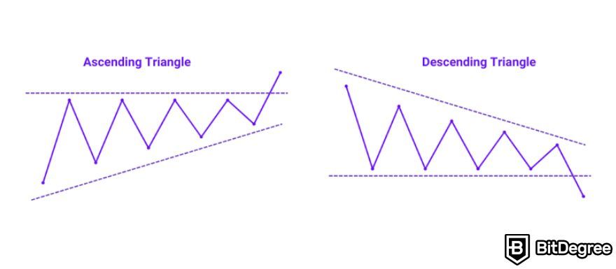
In both ascending and descending triangles, the convergence of the trend lines indicates a period of tightening price action, often referred to as consolidation. This tightening range represents a battle between buyers and sellers, with each attempting to gain control of the market.
The eventual breakout typically occurs with increased trading volume, confirming the direction of the breakout and potentially signaling the beginning of a new trend.
Head and Shoulders / Inverse Head and Shoulders
The head and shoulders pattern typically resembles a hump, with three peaks – a higher peak in the middle (the head) flanked by two smaller peaks (the shoulders). It's a bearish pattern, indicating a possible trend reversal from an uptrend to a downtrend.
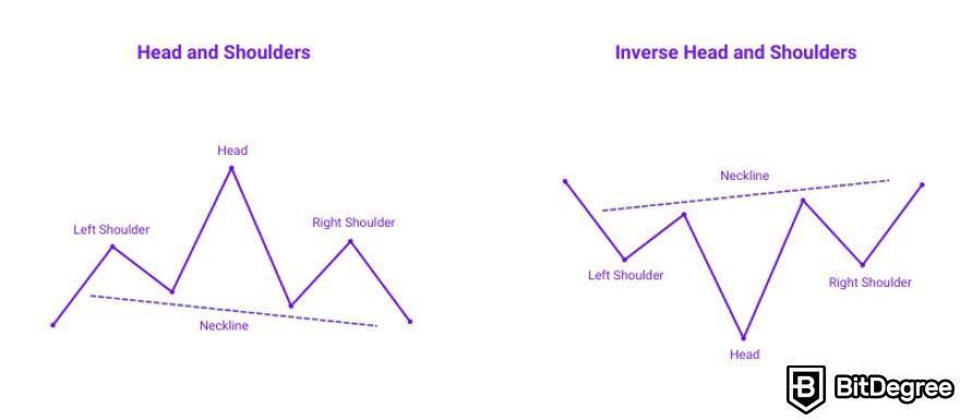
On the flip side, the inverse head and shoulders is a bullish pattern that resembles an upside-down version of its counterpart. It consists of three troughs – a lower trough in the middle (the head) with two higher troughs (the shoulders) on either side.
The head and shoulders pattern represents a shift in market sentiment, with the formation indicating exhaustion of buying pressure during the formation of the right shoulder. This exhaustion is often accompanied by declining trading volumes, further confirming the potential trend reversal.
Breakouts below the neckline in the head and shoulders pattern and above the neckline in the inverse head and shoulders pattern validate the pattern's significance, prompting traders to enter positions aligned with the anticipated trend reversal.
Channel Up / Down
When you see a channel up, it means the price is moving within an upward-sloping boundary. This could indicate an uptrend. A channel down, on the other hand, is the opposite – prices are contained within a downward-sloping boundary, suggesting a potential downtrend.
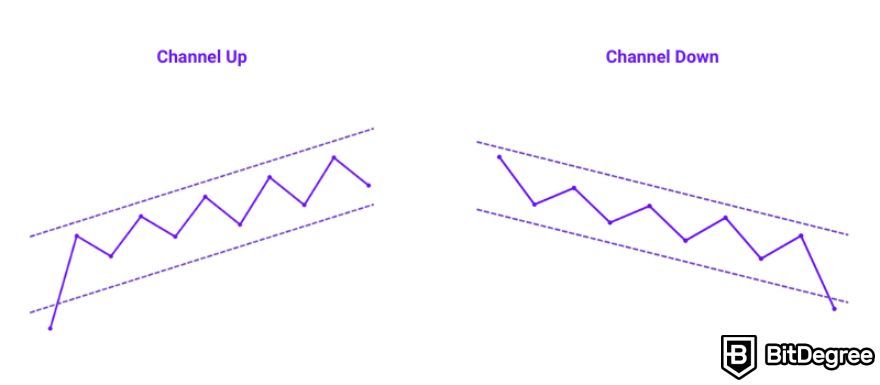
Thus, channels, whether ascending or descending, reflect the ongoing battle between buyers and sellers within a defined price range. Traders who know how to read crypto charts often look for price bounces at these boundaries as potential entry or exit points. The upper boundary of a channel up and the lower boundary of a channel down serve as areas of interest for potential trend reversals or continuation.
Additionally, the width of the channel can provide insights into market volatility, with narrower channels indicating consolidation and wider channels suggesting stronger trends.
Falling / Rising Wedge
Falling and rising wedges represent periods of decreasing or increasing volatility, respectively, within a narrowing price range.
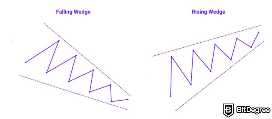
A falling wedge is a bullish pattern, typically indicating that the price may rise. It looks like a contracting triangle, with lower highs and lower lows. Traders often interpret this pattern as a sign of impending bullish momentum, especially when accompanied by increasing trading volumes during the breakout phase.
On the other hand, a rising wedge is a bearish pattern, suggesting that the price might drop. It's an ascending triangle with higher highs and higher lows. The pattern's narrowing range often precedes a breakdown in price, triggering a bearish reversal.
It's important for traders to wait for confirmation through price action and volume before entering trades based on wedge patterns, as false breakouts can occur, leading to potential losses.
Double Bottom / Top
The double bottom and double top patterns represent significant shifts in market sentiment, often reflecting the culmination of buying or selling pressure.
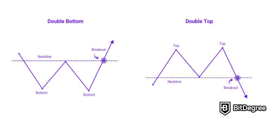
In a double bottom, the formation of two consecutive troughs at approximately the same level signifies a struggle between bears and bulls, with the second trough indicating a failed attempt by bears to push the price lower. This failure often leads to a reversal in the downtrend, as bullish momentum builds and buyers take control.
Conversely, in a double top, two consecutive peaks are formed at a similar price level, indicating a resistance barrier that bulls fail to overcome. This failure signals a potential exhaustion of buying pressure and a shift toward bearish sentiment, prompting traders to anticipate a downward price movement.
Triple Bottom / Top
Triple bottom and triple top patterns are significant formations that emphasize the resilience of support and resistance levels.
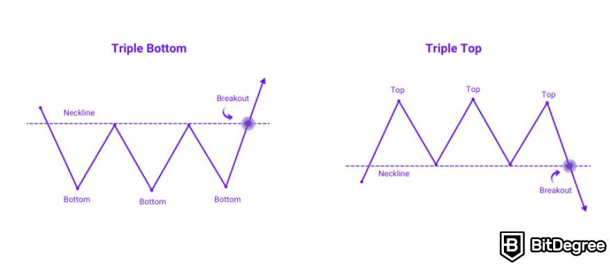
In a triple bottom, the repeated testing of a low price level highlights a notable level of demand, as buyers consistently step in to prevent further declines. This accumulation of buying pressure typically signals a reversal in the prevailing downtrend, as evidenced by a subsequent upward price movement.
In a triple top, on the other hand, the repeated failure of the price to surpass a high point signifies strong resistance from sellers, suggesting a reluctance to push the price higher. This persistent selling pressure often leads to a reversal in the prevailing uptrend, with traders anticipating a downward price movement following a breakdown below the neckline support level.
Bullish / Bearish Flag
Bullish and bearish flag patterns serve as temporary pauses within the context of a broader trend, providing valuable insights into market sentiment.
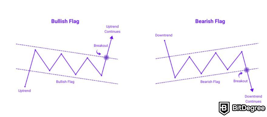
In a bullish flag, the price consolidates following a strong upward movement, forming a rectangular-shaped pattern with declining trading volumes. This consolidation represents a period of profit-taking and reassessment among traders, but the overall bullish sentiment remains intact.
As opposed to that, in a bearish flag, the price consolidates after a notable downward movement, reflecting a temporary respite for sellers amidst a prevailing bearish sentiment. Traders closely monitor these patterns for breakout signals, waiting for price movements accompanied by volume increases to confirm the continuation of the trend, whether upward or downward.
Bullish / Bearish Pennant
Bullish and bearish pennant patterns represent consolidation phases after strong price movements, resembling a triangular shape. These patterns are all about patience.
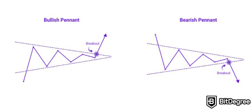
In a bullish pennant, the price consolidates after an upward move, signaling a potential continuation of the uptrend. Conversely, in a bearish pennant, consolidation occurs after a downward move, suggesting a potential continuation of the downtrend.
Traders exercise patience during these periods, awaiting breakout signals to confirm trend continuation. Breakouts from pennant patterns typically occur with increased trading volumes, indicating renewed market interest and offering potential trading opportunities aligned with the prevailing trend.
Bullish / Bearish Rectangle
Rectangles, whether bullish or bearish, represent periods of consolidation within a defined price range, indicating a balance between supply and demand.
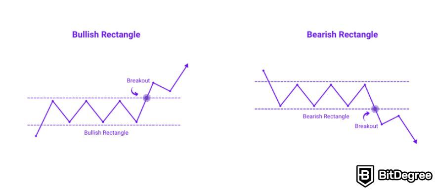
In a bullish rectangle, prices consolidate within a narrow range after an upward movement, suggesting a potential continuation of the uptrend. Conversely, in a bearish rectangle, prices stay within a confined range following a downward movement, signaling a possible continuation of the downtrend.
Traders monitor these patterns for breakout signals, awaiting confirmation of trend continuation or reversal. Breakouts from rectangles, especially with increased trading volumes, provide insights into future price movements and trading opportunities aligned with market sentiment.
Conclusions
Understanding how to read crypto charts is an essential skill for anyone looking to venture into the world of cryptocurrency trading. By decoding these visual representations of market data, you can make well-informed decisions, minimizing the risks associated with this volatile market.
However, it's equally vital to tread cautiously in the world of crypto. To safeguard your investments, always choose reputable cryptocurrency exchanges such as Binance, Bybit, or Kraken.
Also, as you embark on your crypto journey, remember to stay informed, exercise caution, and prioritize security. With your newfound knowledge about reading crypto charts, you'll be better equipped to make wise decisions and navigate the exciting yet unpredictable world of crypto trading.
The content published on this website is not aimed to give any kind of financial, investment, trading, or any other form of advice. BitDegree.org does not endorse or suggest you to buy, sell or hold any kind of cryptocurrency. Before making financial investment decisions, do consult your financial advisor.
Scientific References
1. T. Hagio, M. Sano: 'Evaluation of Price Prediction Models for Cryptocurrencies Based on Convolutional Neural Networks Trained on Candlestick Charts';
2. S. Nison: 'The Candlestick Course';
3. S. Goutte, H. Le, F. Liu, et al.: 'Deep Learning and Technical Analysis in Cryptocurrency Market'.


