A well-made design includes correct usage of colors. In this tutorial, we will explain some tricks for working with Bootstrap colors. It can be helpful when you need to change the overall look of your website or highlight a certain Bootstrap warning.
Using code examples, we will introduce the usage of contextual classes that help simplify the look of your code.
Contents
Bootstrap Colors: Main Tips
- Bootstrap 4 offers classes you can use to add color depending on the context the element is being used in.
- This component of Bootstrap 4 can make reading your code easier by providing contextual clues through the class names.
- Using different prefixes, these classes can be used for both Bootstrap text color and background color, as well as coloring elements.
List of Contextual Classes
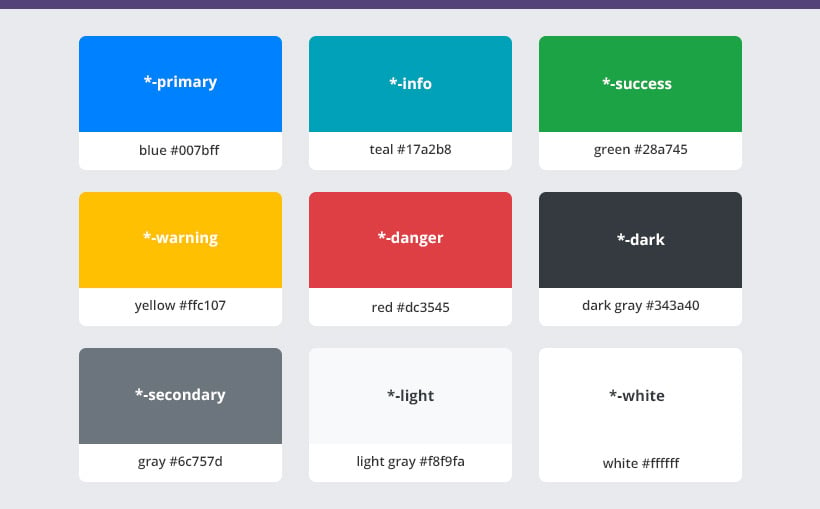
- *-primary changes the color to blue #007bff.
- *-info changes the color to teal #17a2b8.
- *-success changes the color to green #28a745.
- *-warning changes the color to yellow #ffc107.
- *-danger changes the color to red #dc3545.
- *-dark changes the color to dark gray #343a40.
- *-secondary changes the color to gray #6c757d.
- *-light changes the color to light gray #f8f9fa.
- *-white changes the color to white #ffffff.
Depending on what you need to provide the color for, the * can be replaced by various class prefixes (such as text). In the following sections, we will explain how to do just that.
Modifying Bootstrap Colors
Text Color
To use contextual classes for the font color, you should include the text class prefix in the beginning:
In the example below, you can see Bootstrap colors applied to link text:
Note: Bootstrap text colors can also be applied anchors that have hover and focus states.
By adding a third parameter, you can also modify the opacity (in percentage) of Bootstrap colors. In the code example below, you can see how modifying opacity affects text color:
<p class="text-black-50">Black text with 50% opacity</p>
<p class="text-white-50 bg-dark">White text with 50% opacity</p>Background Color
If you need to add some color to your text, but color the background instead of the characters themselves, you should use the bg class prefix:
Note: upon hovering, anchor components colored using a Bootstrap background color class will darken.
Combining Classes
To have more flexibility, you can also use Bootstrap text color and background color classes combined. Have a look a the example below. You can see bg-light text-black-50 is used. Hence, we have a black text with 50 percent opacity and a light grey background:
<p class="bg-light text-black-50">Light background with 50% opacity black text</p>Button Color
Bootstrap contextual classes can also be used to color various page elements, such as buttons. This helps you integrate functionalities into the chosen design seamlessly.
To change the color of Bootstrap button, you should apply a btn prefix for the chosen color class:
Bootstrap Colors: Summary
- Bootstrap contextual classes add color to an element depending on its context.
- Contextual clues in class names make it easier to read scripts.
- You can use these classes for Bootstrap text, background, and element color, as long as you use relevant prefixes.
