Stop overpaying - start transferring money with Ogvio. Sign up, invite friends & grab Rewards now! 🎁
Responsive designs are all the rage these days. It’s only natural: the ever growing number of devices that we use to browse varies greatly in terms of screen size. To be available for use in all of them, a website must be able to adapt to each of them without hassle. The easiest way to achieve that is by using frameworks.
Since its creation in 2011, Bootstrap has been immensely popular among front-end developers. It’s simple to learn and use – however, that doesn’t mean it has it all. What is more, the easily recognizable Bootstrap-based design makes a big part of web look the same. In this tutorial, we will introduce you to a bunch of Bootstrap alternatives that might turn out to match your needs much better.
Table of Contents
Foundation: for sites and emails
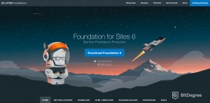
One of the most well-known Bootstrap alternatives is Foundation, published by ZURB in 2011. You can use it for the front-end of responsive websites and applications. The developers at ZURB also claim Foundation is compatible with absolutely any back-end technology and any server.
Latest DataCamp Coupon Found:
Just like Bootstrap, Foundation is open-source: you can find all the files on GitHub. The structure of the framework is created using HTML, CSS, and JavaScript, and the framework itself runs in the browser without the need for any additional software.
The very origin of Foundation lies in the rules of the ZURB style guide that the company followed since 2008. In time, it grew into a framework which the team used internally at first and released to public later. ZURB uses Foundation for its clients now as well: the list includes names as popular as Coca Cola, Pixar, Barclays, Ford, and a whole bunch of others.
Since the beginning, the team worked with a mobile-first approach. The user is advised to start from creating the smallest version of their design first, and then expand it. Designing from the bottom-up lets the developer avoid overloading the smaller screens with unnecessary features that would slow loading down.
Using Foundation for Emails, you can also create responsive emails. This is an extremely useful feature nowadays: it’s been estimated that more than half of the emails are opened on mobile devices. This is also the way 75 percent of Gmail users (which makes a whopping 675 million people!) access their accounts.

Comparing Bootstrap vs. Foundation, we can see a few clear differences right away. While Bootstrap is clearly more popular, this also gives a Foundation-based website a slight edge of having a more distinctive design. Another advantage it has is the built-in extra widgets. You can use Abide for form validation, add off-canvas menus and automatic pricing tables where appropriate. Code written is Foundation is also generally more lightweight.
Bulma: the pure CSS choice

Another one of the Bootstrap alternatives to consider is Bulma. Compared to the other popular front-end frameworks, it is rather new (only available to coders since 2016). However, it has a very clear distinction: using Bulma involves no JavaScript – just pure CSS.
In its essence, Bulma is a library of CSS classes. The box model it uses is fully-based on Flexbox. Basically, Bulma is made of less than forty SASS (Syntactically Awesome Style Sheets) files. You can import them individually if you do not wish to use all the features.
Just like Foundation, Bulma sports a mobile-first approach and prioritizes vertical reading optimization. This means the default layout will stack the columns vertically and hide the navigation menu at the mobile breakpoint. And before you ask – yes, the other available breakpoints have rather intuitive names as well: it’s tablet, desktop, widescreen, and fullhd. Overall, the readable and easy-to-understand syntax is another strength of Bulma.
No need for JavaScript and beginner-friendly syntax are not the only advantages you can name when comparing Bulma vs. Bootstrap. It also comes equipped with more than a hundred CSS helper classes and a complete Font Awesome support. However, Bootstrap has a slight edge of having a wider user community. It also works slightly better in Internet Explorer.
Bootstrap alternatives based on Material Design
Google developed a design language called Material Design in 2014 and presented significant updates to in 2018. The idea came from the card feature introduced by Google Now. As it became a consistent design language, it started to support grid layouts, depth effects, and responsive animations. According to the developers, they took inspiration from paper and ink. Material Design was meant to be used for Google’s own applications at first. It works smoothly in all Android versions, too. However, in time, the set of tools became available to the public.
There are two frameworks based on the Material Design language. The first one is called Material Design Lite (MDL). The last word in the title represents the simplicity of use, little size, and a single goal (website design only). Not only it has a huge variety of components, but you can also combine it with the Elm coding language. Due to various templates, MDL might be one of the simplest Bootstrap alternatives for a beginner. However, this also means there is a risk your website might lack the unique touch.

Next, we have a responsive front-end framework called Materialize. To put it simply, it is a lightweight library created with CSS, JavaScript, and HTML. You can either use a standard or a SASS-based version – however, keep in mind that both take up quite a lot of memory, when compared to other Bootstrap alternatives.

Materialize is platform-neutral, which means the design you create will look equally great on a screen of any size. Unfortunately, same cannot be said about browser compatibility due to the fact it doesn’t use Flexbox. This might cause issues when running in Internet Explorer now and raise the risk of compatibility in the future.
As you compare Bootstrap vs. Material Design based frameworks, the first and foremost difference is the user base. Bootstrap has been around for a few years longer, which resulted in a lot more users. As of now, it has 137,000 stars on GitHub, while Materialize has 37,000 and MDL 31,000. It’s easier for a Bootstrap beginner to get help in community forums and user groups, hence, the learning curve doesn’t seem that intimidating.
The heavyweight: Semantic UI
The first thing a developer usually notices about this next framework is its size. As you compare Semantic UI vs. Bootstrap, consider this: the most basic form of Semantic UI comes with over twenty themes, while Bootstrap only has one. This thing sure is huge. It’s not that simple to install, either.

However, there is a reason for the heaviness. Nothing matches Semantic UI if you’re looking for personalization. More than three thousand theming variables and UI components offer the user many more options and elements than Bootstrap ever could. The main principle the developers had in mind when creating the framework was progressive truthfulness. The idea is that Semantic UI users should aim to choose the available variables and personalize them, instead of starting with an empty page.
As the name itself suggests, the next advantage of the Semantic UI lies in semantics. Using class names that are simple to read and understand makes it simple and even intuitive for a newbie to start working with the framework. Moreover, Semantic UI simplifies debugging and supports a ton of external applications, including but not limited to Meteor, React, and Angular.
Semantic UI was first released in 2013. The newest available version is 2.4, which introduced the clearable dropdowns, placeholders, and placeholder segments, as well as improved flexbox modals.
You might also come upon a framework called Unsemantic. Don't get mixed up: despite the similar names, Semantic UI and Unsemantic are two completely different projects. Nathan Smith created Unsemantic as a successor for his previous project, called 960 Grid System. However, the new one never became a true contender. By the end of 2023, it has just over one thousand stars on GitHub, and the date for the last commit is almost two years ago. It’s probably safe to say it is barely a contender when choosing one of the Bootstrap alternatives.


Did you know?
Have you ever wondered which online learning platforms are the best for your career?
So – Bootstrap or the alternatives?
Bootstrap is great. However, different frameworks might work better for different projects. We hope our comprehensive introduction to the most popular Bootstrap alternatives helped you understand their distinctions and make your choice.
If you decide to stick with Bootstrap, there's nothing wrong with that either – it's popular and widely used for a reason. Just make sure you get the most of it: get all the top tips and tricks from BitDegree's interactive Bootstrap course!


